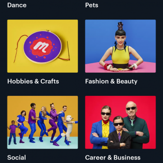
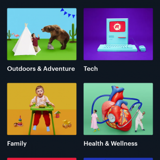
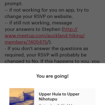
Now that Meetup HQ have deployed their anticipated New Branding, I will confess that it does on the surface perhaps present a happier, playful, more casual and ultimately more
inviting feel.
The changes however are not without controversy, with many paying organizers understandably feeling upset that Meetup HQ is seemingly running roughshod over their desires and wishes, with several documented bugs still outstanding while focus and resources supposedly having been instead directed into this rebranding exercise in order to deploy their “Vision”
It is quite possible that MeetUp are possibly following more the same path that many Consumer Tech companies (e.g Apple) have gone and creating / spinning off their own market (where perhaps none existed before) where in effect, what they’re selling is a dream or (their brand of) Experience.
Having played with the App, my feeling is that I perhaps enjoy the cleaner feel of the Mobile Website instead. While the new App presents a fun loving “brand”, the app is a lot more cluttered then the Mobile Web interface I feel
More soon (When I have time)
